Photography / Art Direction / 2005-Present
Editorial
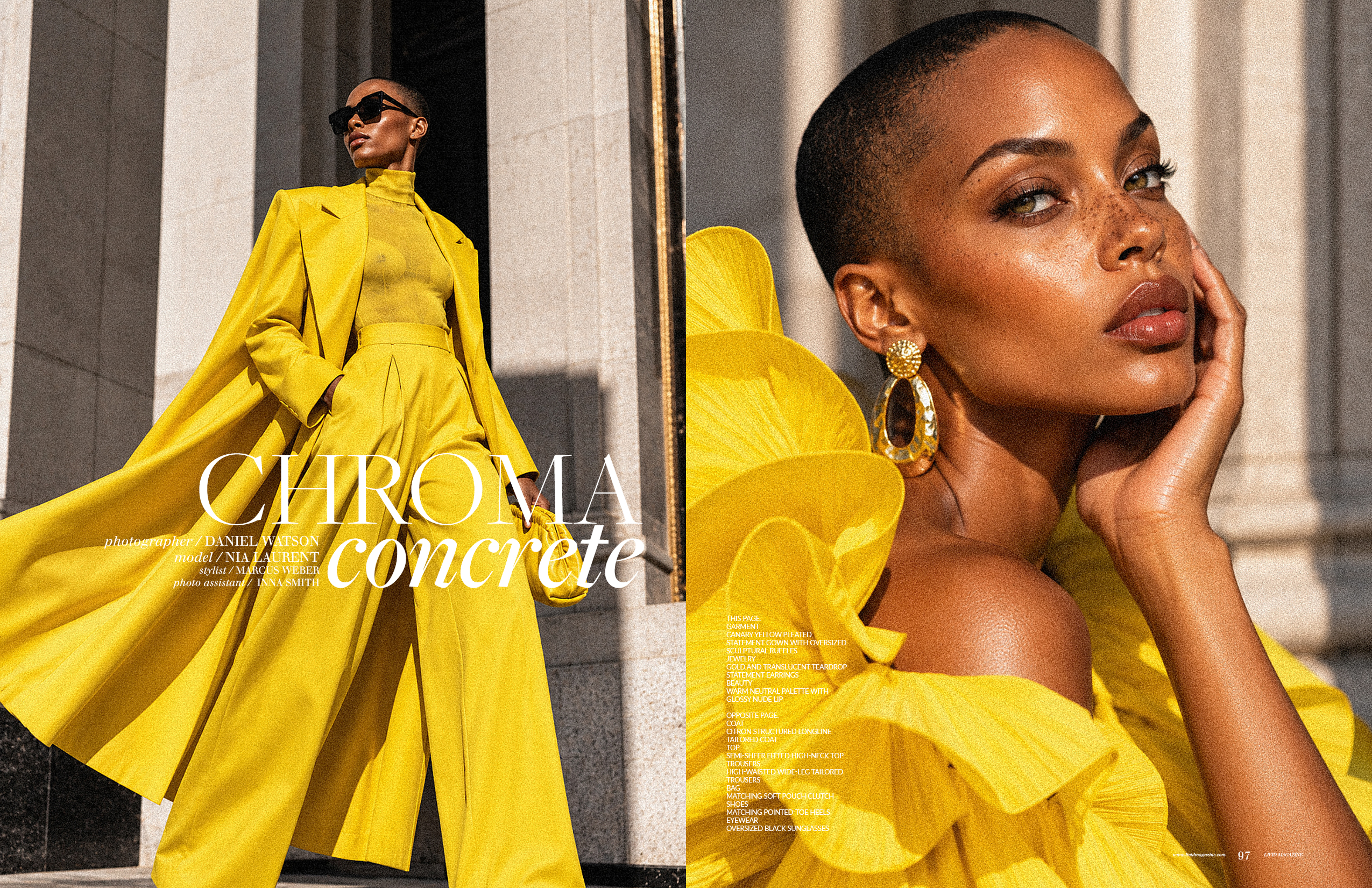
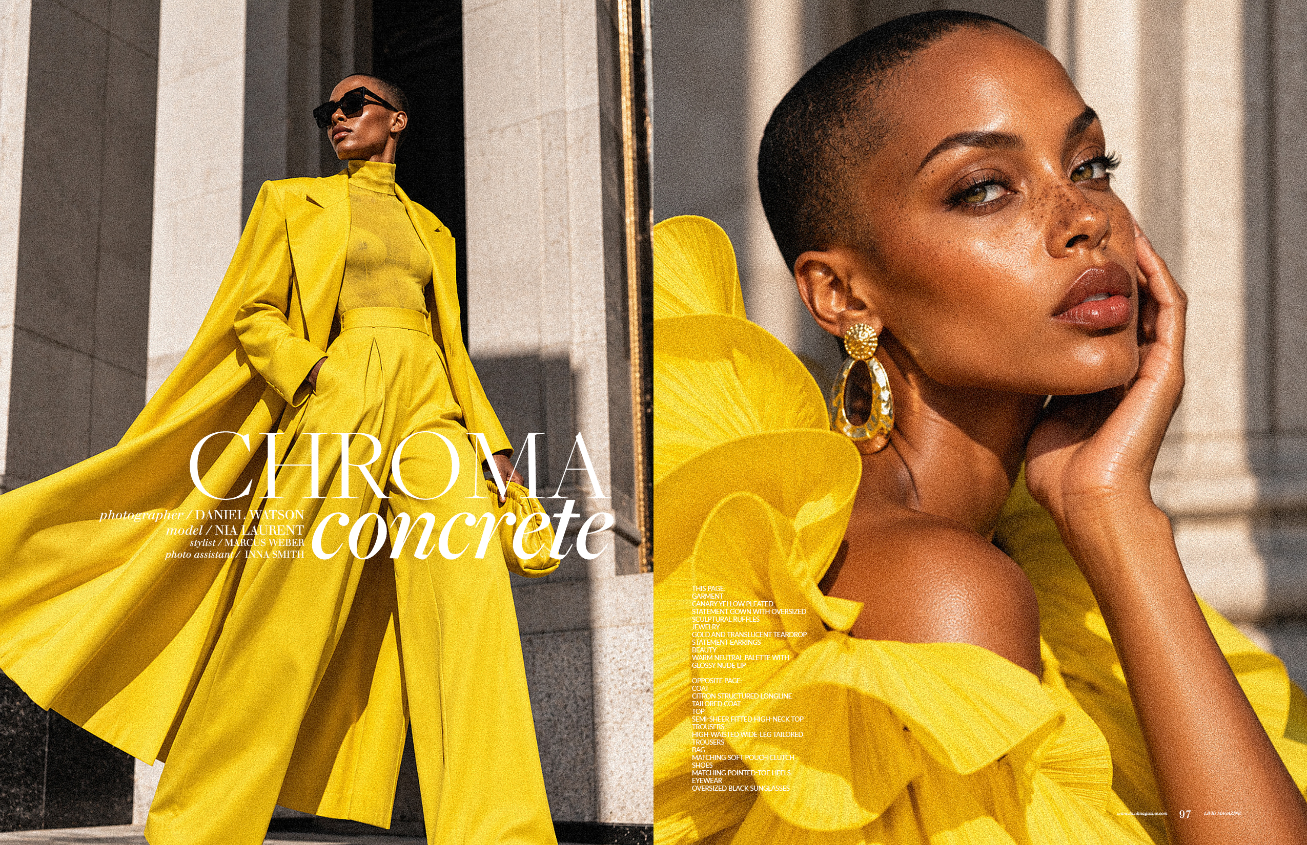
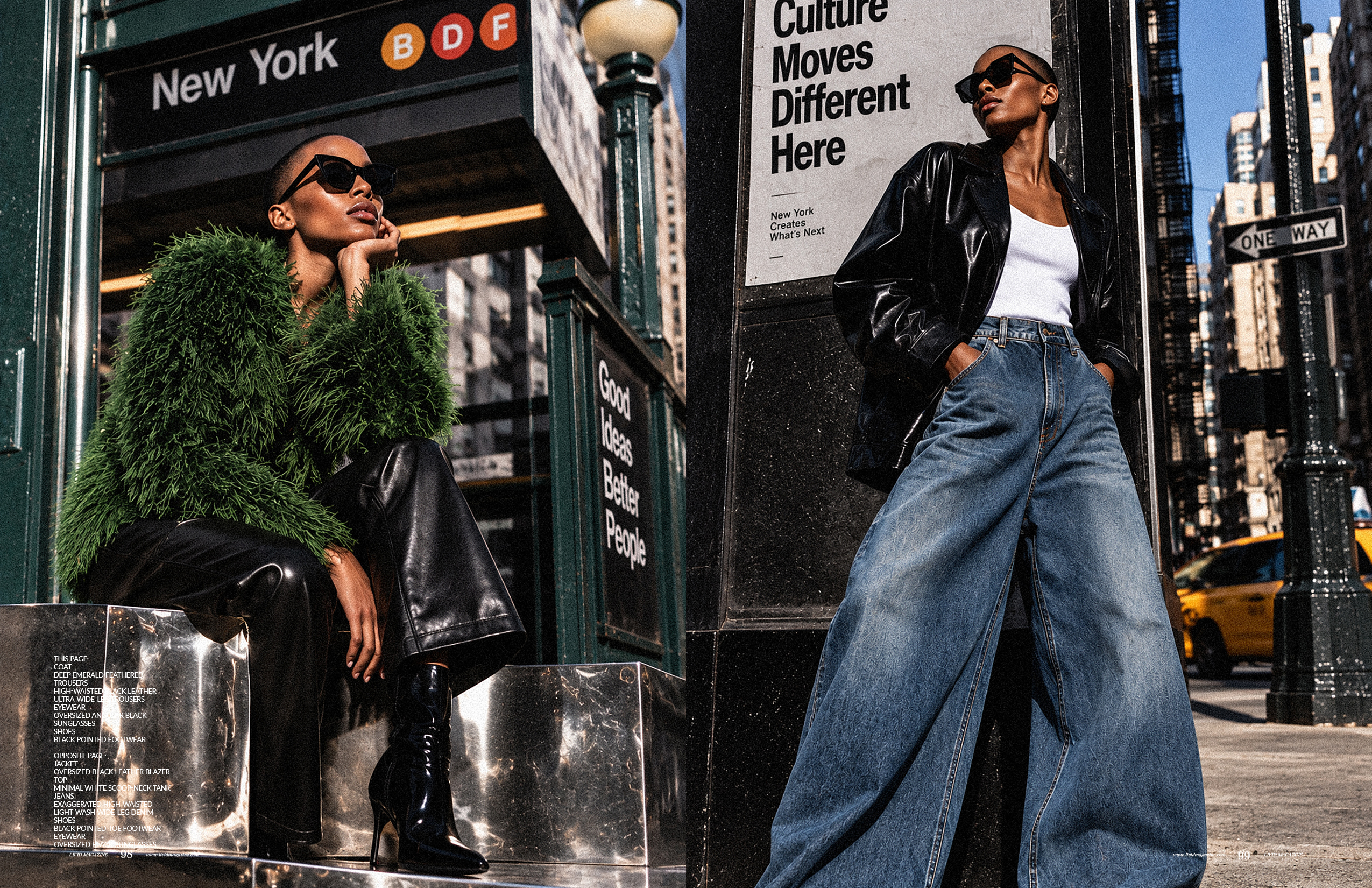
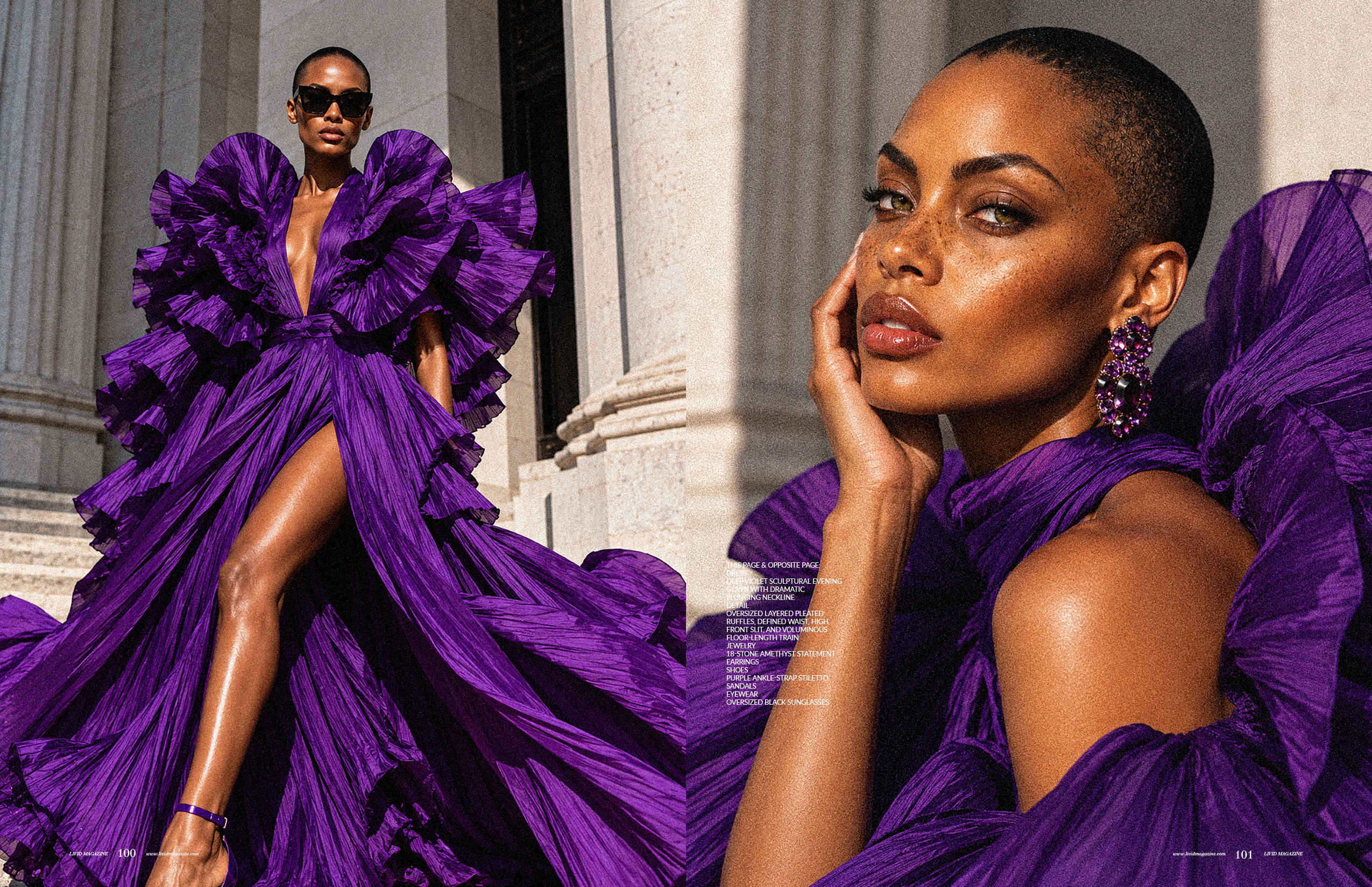
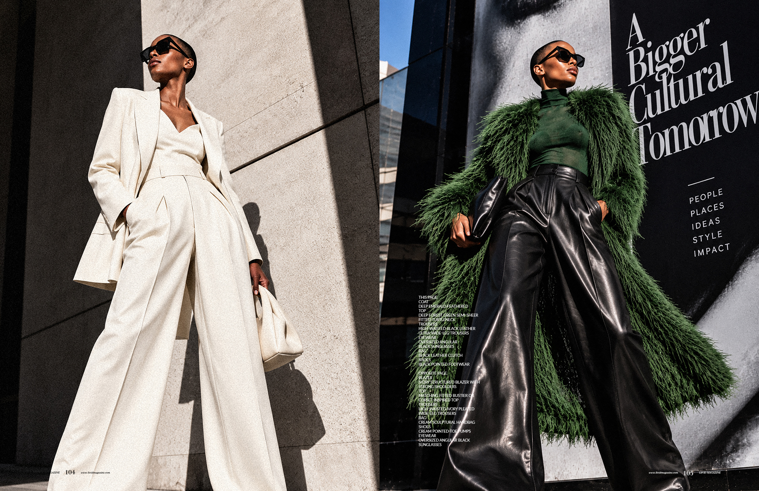
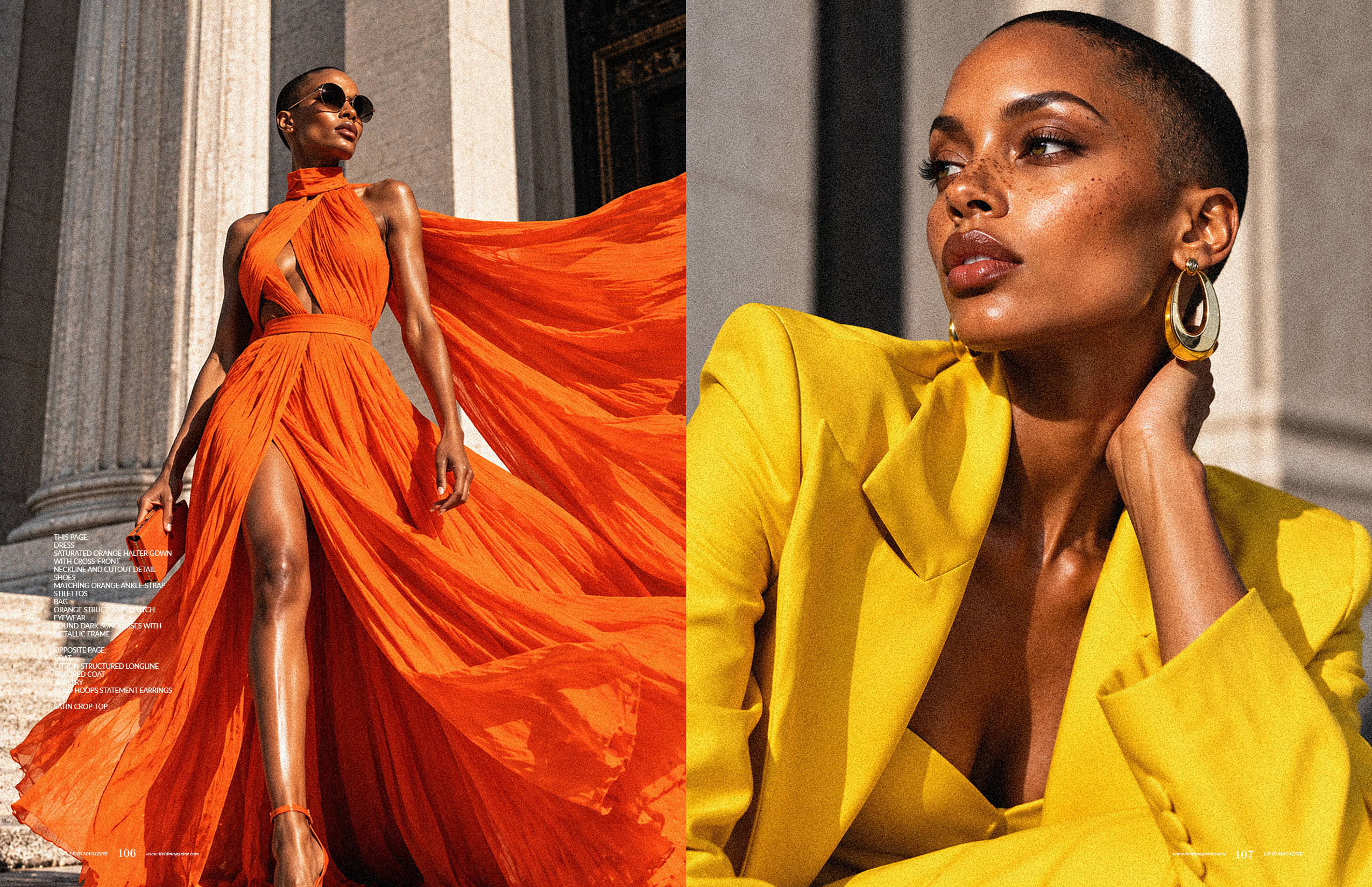
CHROMA CONCRETE explores what happens when fashion refuses to disappear into the city around it. Photographed against the hard geometry, cultural signage, stone facades, and constant movement of New York, the editorial uses saturated color, exaggerated proportion, and sculptural tailoring to build a visual study of modern power dressing. Across nine images, Nia Laurent moves between couture-scale gowns, monochromatic tailoring, leather, denim, and dramatic outerwear. Each look changes the silhouette, but the character remains constant: composed, visible, and entirely in command of the frame. The series approaches fashion photography not simply as documentation of clothing, but as an exercise in creative direction, movement, architecture, color, and visual identity. A study in color, architecture, confidence, and scale.
The challenge
The challenge was to photograph highly expressive fashion inside an environment that is already visually aggressive. New York competes for attention. Architecture, advertising, traffic, pedestrians, signage, shadows, and scale can quickly overpower a subject. Rather than eliminating that visual noise, the challenge became using it. The photography needed to allow each garment to retain its shape, texture, and color while making the model feel larger than the environment surrounding her.
The insight
Fashion gains power when the environment becomes part of the styling. Instead of treating the city as a backdrop, I approached its architecture, signage, shadows, traffic, and perspective as additional elements within the composition. Low camera angles increased scale. Hard sunlight sharpened silhouettes. Monochromatic styling separated the subject from the urban environment. Movement in fabric created contrast against rigid architecture. The city did not need to become quieter. The subject needed to become stronger.
The idea
The visual concept was built around contrast: CHROMA CONCRETE. Each look was assigned a distinct visual language through color, material, silhouette, and movement. Saturated yellow, violet, orange, red, and green created visual interruption against stone and pavement. Black leather, oversized denim, ivory tailoring, and exaggerated trousers introduced structure. Flowing trains, pleating, feathers, and ruffles introduced movement. I photographed much of the series from below the model's natural eye line, transforming sidewalks, steps, and city corners into monumental environments. The styling moves between fantasy and familiarity, from sculptural gowns to denim and leather, allowing the editorial to feel aspirational without becoming detached from the energy of New York.
The result
The final nine-image series creates a cohesive editorial world without requiring every photograph to look the same. Color, proportion, perspective, movement, and the recurring presence of the city connect the images while allowing each wardrobe story to maintain its own identity. The result is a fashion editorial that operates simultaneously as portraiture, styling study, and visual narrative. CHROMA CONCRETE reflects the approach I bring to editorial photography more broadly: fashion should not simply occupy the frame. It should alter the way the frame feels.